Friday, October 14, 2011

Katherine's second Acrylic Painting


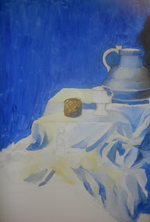
This is the still life objects I set up for Katherine's second acrylic painting.
I kept the color scheme limited, and Katherine's pallet will be limited.


She made a sketch, starting with covering up the background; her pallet is consisted of black, white, blue, and yellow ocher.


Katherine paints with light and dark in mind first, and distributes the colors all around.


You can see the forms, the light source and the shade, and beautifully used colors.


One thing bothered was the diagonally cut, long, and kind of dull looking background. So, we decided to add some fun elements. We pasted floral pattern paper on the background.


Do you see the triangular shape right above the drapery on the left? It looked better bright, so Katherine decides to extend pasting the patterned paper.


Here's where she's at. Starting all over again with the background.


After one week, Katherine sees how it's all going to come together. She's almost there!


by Hannah

I'm working with Katherine suggesting the background should be as exciting but not overpowering. 


by Hannah

I'm almost done with my owl painting too.


After 5 classes of hard work, Katherine is happy to announce that she is done!
We have completed our acrylic paintings; we learned a great deal of creating an interesting background for the still life objects keeping in overall ambiance in mind.

 by Katherine


by Hannah

Wednesday, October 12, 2011

Duck-iraffe

by Leah (6)


This is Leah's Duck-iraffe painting. She's working on a project from a FCPS inservice packet on Multiple Intelligence.
The questions were: Draw a duck-iraffe. Where does it live? What are its enemies?
Leah first thought of an animal that is a half duck and a half giraffe. But she needed to have some knowledge on the foods that ducks and giraffes eat, and their habitats. So we talked about those; those elements became the preliminary ideas and backgrounds for her to make connections and branch out her creativity.

Leah thought she wanted to put the creature's enemy waaay back if she had to. The octopus under the tree is the giant octopus that is very far away.

Always happy to see the world from her perspective.

Tuesday, October 11, 2011

Copy Cat Portraits

by Hannah

This study was inspired by another art blog that artist woman.
It's great for tonality, color, and symmetry studies. You'll need an image that's frontal, a paper that's suitable for the medium that you'll use to color. I usually draw or paint with students to show, or find new things to teach. We all used watercolor on watercolor paper, and found images on google image search.


by Katherine (15)

Katherine first studied the details on design and pattern finding the right placement.


by Katherine (15)

Second, she used watercolor to paint but this time, she wanted to challenge herself with water reflection.


   by Min (10)

Min had a fun time trying to make it perfectly symmetrical and matching colors.


by Leo (10)

Everyone liked the background and the eye of Leo's work. 


by Leah (6)

Not only she wants to depict the image the best she could, but she adds colors on the background because she says "It looks better".


Saturday, October 8, 2011

Doi-E-Die


This is one of a scene from a 'book making project' that Andrew and Leo started working on about a month ago. They have a general idea of how the story goes, and they are creating a story book depicting important scenes in the story. I liked this particular scene and saw potential. I thought it'll be great if they expand their skill to elaborate their idea utilizing colors and details.


So, that's what they did; using effective colors to capture the scene more realistically learning how to render acrylic painting.


They are not stopping here! They are using more materials to show dynamics in expressing their ideas and skills to enhance the book making project.


This guy's name is Ukira, one of the main character in the story, made by Andrew.
It's exciting to see what fun ideas Andrew and Leo come up with, and work well together to create wonderful art! 


Hector Before


Hector
After studying the drawing of Hector, Leo could produce a much better quality work. Nicely done!


    Hector After


Introducing the main characters!!


Hector

Dr. Doi E. Die

Xin Bo

Ukira


It's been a while everyone! The kids are working on the scenes for a clay-mation project for a long time. They are working on two other scenes...meanwhile, this is one of the scenes!

DK's painting


This was done by a 7th grader, DK, over the summer. He was inspired by an image that he found on google image search. The painting is divided into three sections (triptych) to study three elements in art: movement in line, color flow, and unity.

Friday, October 7, 2011

Tree Project


My husband recently purchased a 60 inch television, which he claimed was for the family (who's he kidding--it was for him!); to me, the best part of the television was the cardboard box it came in.  While my husband was watching another high-definition episode of American Chopper, I stared at the cardboard, and decided to outline a tree!


For those of you who don't watch American Chopper, it's about a family that designes motor bikes.  I'm not crazy about the show, but I'm interested in the show's attempt to balance an artist's vision versus business goals and demands (something that I'm sure all of us can relate with).  While my husband was fascinated with the tension, I started cutting my tree outline with an exacto knife.  With each cut, I liked what I was seeing.  


At the end of the American Chopper episode, Paul Junior had created a mind-blowing one-of-a-kind chopper.  And with each cut, my tree continued to grow: more branches ... a root base ... imagine what could be placed on the branches? ... so, even more branches (especially up top) ... hmmm, how about transforming it into a 3 dimensional piece ... how about cutting a slit in the middle of the multiple pieces and creating a free-standing tree piece? .... on and on ... and when all was said and done, here's what turned out!  


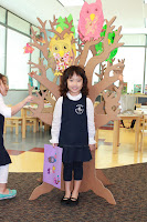
Being satisfied with the result, I brought the tree to my Montessori art class.  The reaction from the kids was priceless!  Something about trees in general, and perhaps the size of this particular tree, and its three dimensional quality--it all truly inspired the kids to decorate the tree with colorful owls, leaves, bunnies, they wanted to create a stream next to the tree, squirrels, and they kept chiming in with more and more ideas.


They each took pictures next to the tree, and it remains in the classroom today--continuing to inspire ideas, and giving the students a genuine sense of accomplishment.  


              Ta Da!  I love how it turned out.  The tree was made possible by, among other things, the creative genius of the Montessori kids, my husband's wish to own a ridiculously large television, and an all new episode of American Chopper!

Monday, October 3, 2011

Grave Danger: Enter Tilted Halo


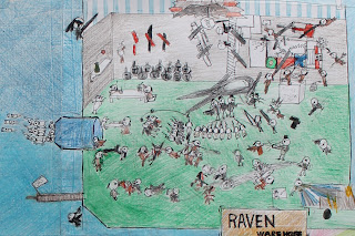
So, here we are with the third scene on the book making project. Leo and Justin are becoming more attentive to details, more elaborate on expressing what's going on in the story. They are mixing many mediums to depict the best scenes in the big picture. They are going to use acrylic painting to create the next scene. Zoom into see all the details!
....


This is a better look for all the details that Justin and Leo put lots of hours and efforts in. They drew with pencils extending 8x12 papers horizontally, and vertically. They defined the designs and tones with different types of markers, and then used prisma color pencils.  The story continues....